Requirements
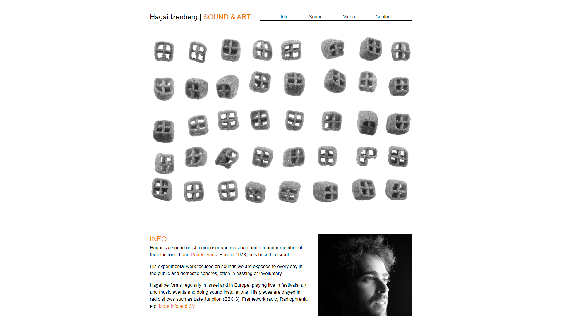
Hagai had designed his website and was happy with the layout on desktop but needed his site to display correctly on mobile devices. His design simply involved a fixed width container and was not able to adjust to smaller viewport sizes leading to a poor experience for mobile users.
The Process
After some discussion, we decided the easiest option would be to remake the site from the ground up. The design was simple enough for a rebuild to be a quick and easy task that would save time compared to learning the existing code base.
With the new version of the site created, I added responsive breakpoints which allow items which display side by side on desktop resolutions to drop into a single column on mobile. I also ensured all images and embedded elements were sized based on the width of their containers so they span the full width at any screen size.
The navigation, which now used anchor links and the CSS scroll-behavior: smooth property to scroll the page smoothly to the required section, was also made to adjust responsively to the viewport. On desktop it is shown beside the logotype matching the original design but breaks onto its own line once there is no longer room for it.
As part of my service, I also ensured that the user experience of the site was as good as possible. The embedded content is now lazy loaded to improve the page loading time. I also added descriptive alt text to the images on the site so any visually impaired users can benefit from a richer experience from their screen reader.